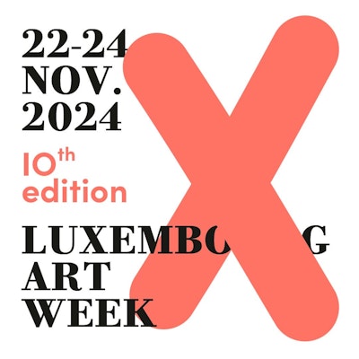
Entrusted to the Luxembourg design studio Designbureau, this visual identity reinterpretation intends to elevate Luxembourg Art Week beyond a mere event stance, positioning it as a brand with programming that extends “hors-les-murs”, both temporally and spatially.
The objective is clear: to reflect the national roots of the fair, act as a catalyst for local and cross-border collaborations and embody a form of enhanced maturity without conceding anything to contemporaneity.
In 2024, the central element of this identity is the " X ", a graphic Roman numeral with a signal function for the anniversary edition and multiple meanings, recalling Luxembourg's geographical crossroads in Europe and its innovative, forward-looking nature.
Revisiting classic forms, the Bodoni and Sofia fonts and their combination bring a touch of minimal contemporary elegance. The beaming color was chosen to awaken attention and is a welcome change to the soft atmosphere of autumn.
The website now offers seamless intuitive experience, making navigation easy for all stakeholders, from galleries to visitors.
22–24 NOV. 2024 is to be marked with a big "X" in the calendars to celebrate the 10th edition of Luxembourg Art Week.
